ShopDreamUp AI ArtDreamUp
Deviation Actions


Description
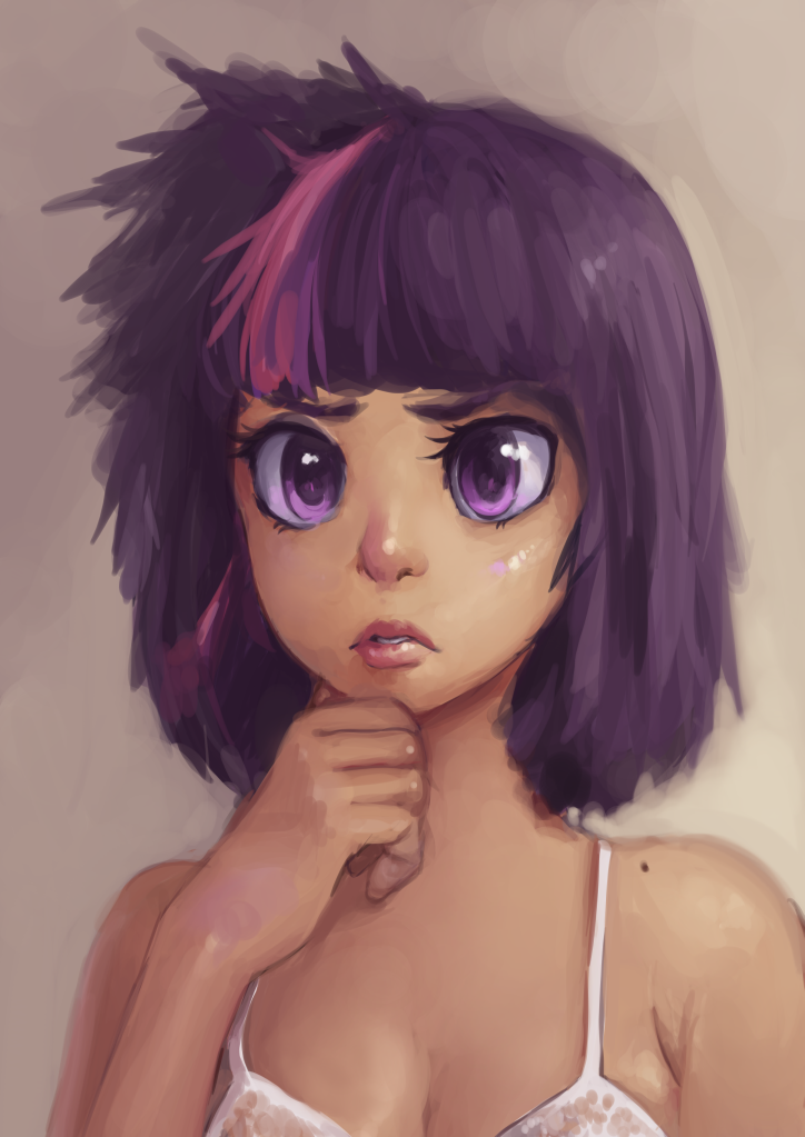
Apparently she wears a bra when she sleeps.
I've uploaded one-fourth of the original size because this is what it looks like zoomed in.
I've uploaded one-fourth of the original size because this is what it looks like zoomed in.
Image size
724x1023px 479.37 KB
© 2012 - 2024 MorsAngelos
Comments100
Join the community to add your comment. Already a deviant? Log In
To begin with, I'm generally not a big anthropony fan, but I like this concept a lot. It's just a little bit sexy, which I greatly prefer to some of the less subtle displays. She has a far away look about her, and the pensive pose enhances her intellectual appeal. Her eyes are luminous and liquid and the eyelashes moist. I love that little mole on her shoulder; it makes her much more genuine. The interaction between her body and the negligee (or bra or whatever) is very convincing and gives the impression of depth, texture and the breathing motion. Her hair has a feathery quality to it, which is the result of broader strokes and a fairly low opacity, giving it depth and an interesting texture. And of course I absolutely adore her nose. I want to boop it. She looks very soft and warm.
There are two negatives which take away from the otherwise superb technique, in my opinion. That hand seems a bit off. The back of the hand is too long and has looks off line from the rest of the arm, almost like you did the fingers first and then the arm up to the wrist and the join between the two is awkward. The fingers themselves are quite good. I assume that rose color is from her sleeping on it. I don't think I could draw a good hand if someone had a gun to my head, so please don't take this too hard; I'm sure you know that hands are the hardest parts of the body to represent.
The other thing is that the hair on the right side of her head seems to have had less effort put into it. The strokes appear rushed and bidirectional, almost a scribble, especially at the very top. I know that is the tousled part, but it seems you should have put more effort into blending that distinctive feature in with the rest of the piece. The low opacity strokes probably shouldn't be directly against the background. If you'd gotten the hand shape right and made the hair on that part of the head with the same attention to detail you put into the rest of the piece, you'd have gotten 5 stars from me on technique. Very, very good work!